
Scroll
Challenge
Four commissions across one era of Doctor Who. A reimagined logo returning to the diamond of the Tom Baker years, unveiled in a teaser for the Disney+ partnership; a Dalek shot the way a marque shoots a car; and the 60th-anniversary key art brought to life as cinemagraphs. Different jobs, one demand — honour sixty years of heritage while making the show feel newly minted.
Approach
The new logo returns to the diamond — the shape used through Tom Baker’s tenure as the Fourth Doctor, and the most recognisable of the show’s many identities.
Reaching back that far carries a risk. A heritage mark can read as nostalgia rather than confidence, particularly for a programme that has renewed itself as often as this one. So the design had to work as a broadcast asset first and a reference second: legible small, built to animate, and robust enough to hold across broadcast, iPlayer and social without softening.
The teaser promo unveiled it ahead of the series launch, treating the logo as an object with weight and dimension rather than a flat graphic to be revealed. Sound design carries as much of that reveal as the picture does.
A milestone like this invites a retrospective. This was deliberately the opposite: a current mark that happens to carry the show’s oldest shape.

Sequence Stills
The teaser announced the Disney+ era — the first asset to carry the new identity to a worldwide audience in one film. It treats the logo as an object with weight and dimension rather than a flat graphic to be revealed, the mark arriving out of the nebula; sound design carries as much of the reveal as the picture does.
Doctor Who

Doctor Who
CG Work
Motion
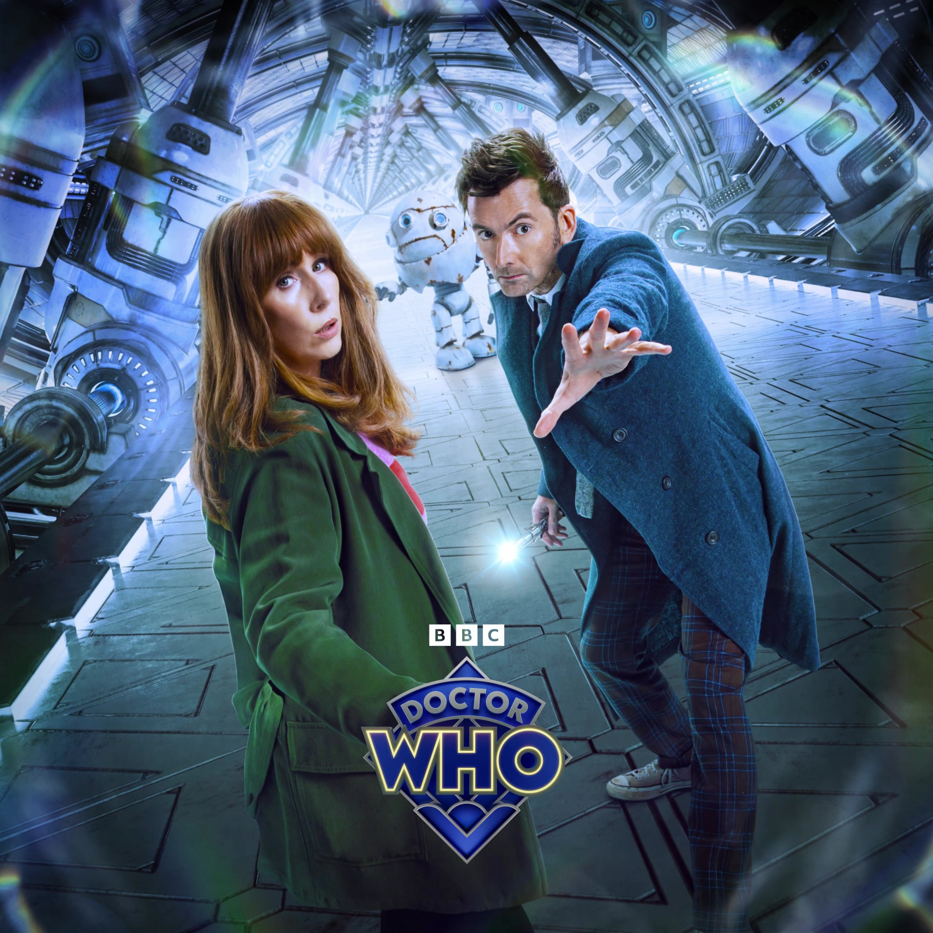
For the 60th anniversary specials, the campaign’s character art was brought to life as cinemagraphs: portraits that hold like print and move just enough. A drift of nebula, a breath, a flicker — enough to stop a scrolling thumb without breaking the pose.

Doctor Who
Results